 Design Trends")
Trends come and go
But classic elements of good design are timeless. Earlier in the year Behance and others have certainly nailed it in terms of what the year held in trends. We’ve all seen numerous examples of them all over the digital space and beyond. But the question I pose to our design community is, are they good? Are you a trend follower, or a trend setter?
Check out the 2017 Design Trends article on Behance or a similar summary on Vengage.
I think we all know that we’d like to consider ourselves trend setters, but the reality of design and art is, that every good designer is influenced by popular culture and trends. What’s the cliche saying? “Good designers copy, great designers steal”.
Perhaps it dates me, but…I lived through the 80’s and big part of what we’re seeing right now is a resurgence of 80’s styles. I’ve stayed on trend in many ways, because the companies and clients I work for are asking for the styles, but I have to say, some of them suck. Here are the ones that I think are going to pass in the next year or two because of their inherent flaws.
The Bad
Gradient Overlays
We see these all over the web right now, most notably in Facebook where some app allows you to type in a typographical statement on a bright color gradient background. This is the most simple minded design style I’ve seen in a while. Ya, bright colors are really awesome in RGB color, on a nice monitor, but in the real world, it doesn’t add anything to a design.
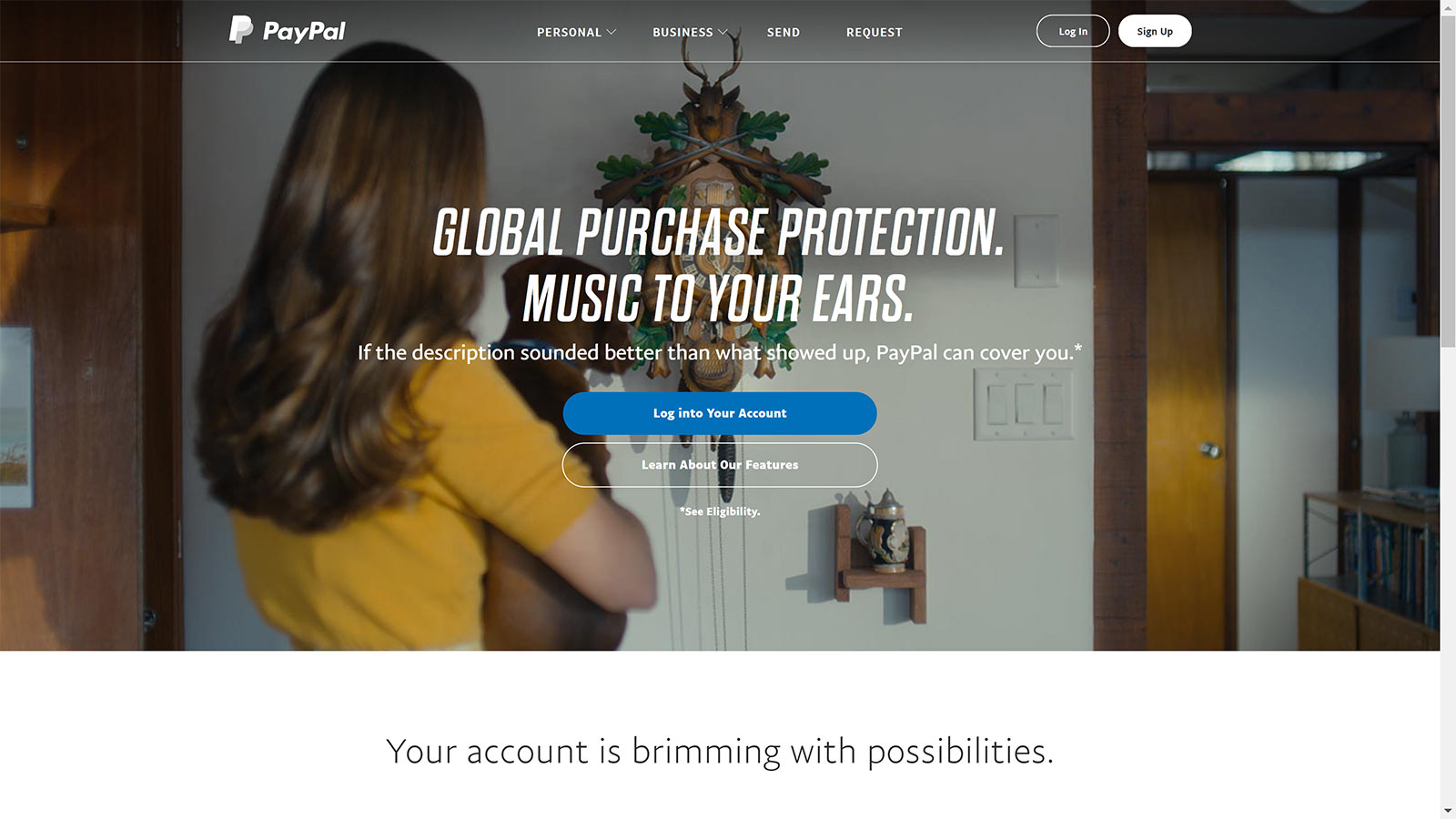
The color or black overlay over a picture is over rated as well, and doing that just to make typography readable on a layout is a crutch to use a photo that doesn’t have enough white space for text anyway. Take a look, how readable is this text on the PayPal splash? Very distracting. In fact, this trend is very hard to do right, and is even more challenging when your design needs to be responsive.
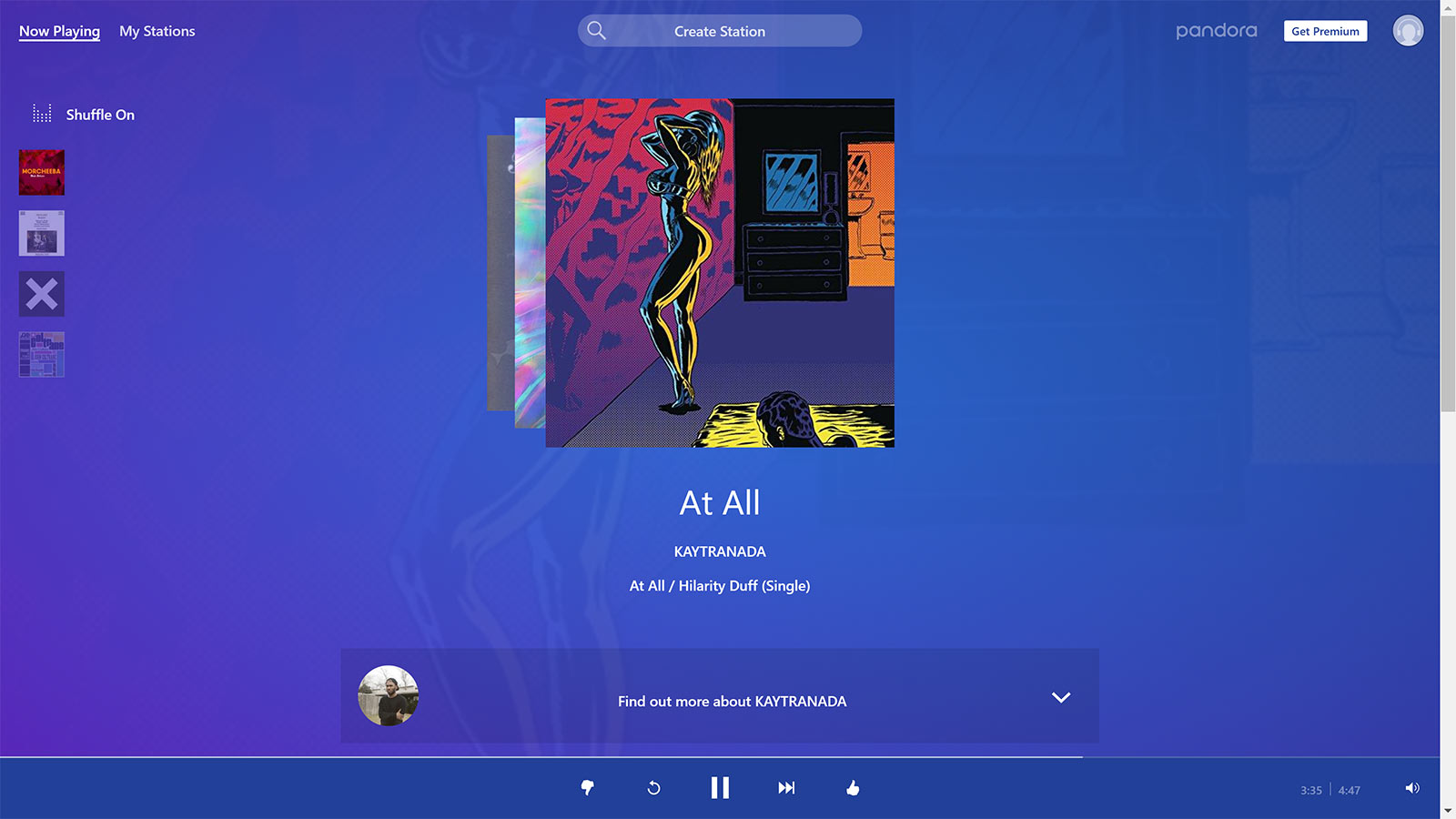
Here’s another example of it…the blue gradient overlay. I’ve had to implement this for a couple different clients now, and I have to say, it’s just copying. PayPal, LinkedIn, FaceBook, Microsoft, Pandora, are all starting to look so generic it’s just diluting all the brands. Yes, blue is a trustworthy color, but come on people, bright blue is PLAYED OUT!
Now I am a fan of the Pandora logo rework, however, I’m not a fan of the new desktop UI. I like to see the art of the album cover larger, and that bright blue clashes with a ton of the art…blue doesn’t play well with every color on the color wheel, hence the use of gray so much in User Interface Design.
Wireframe Icons Style
![]()
This is a big trend in design right now, but it’s not sustainable. Iconography, by default is boiling a concept down to it’s essence, in all or nothing fashion. I think that wire frame icons will be going away in the near future, as UI designs for apps require something that translates at very small sizes. I see that Windows has updated their user interface and Outlook now uses the wire frame icons, and they indeed work well on my UHD monitor, but when we’re truly trying to build applications that respond to every device size, I don’t think they will work well in the mobile platform. I think Apple started this trend, then Microsoft is adopting it, and it’s the only real design mistake that the Apple OS has made to date.
Light Outlined Buttons
This trend can go away and I think it will pretty soon. As you can see in the PayPal screen above, they just get lost. Now you may say “You’re a hypocrite, I see that button style on your home page”. But look closer, I’m using a thicker outline, All Caps in the button and bold face, so that attention doesn’t get lost over top of an image, the way it does with the PayPal UI and others I’ve seen using lighter font faces and title case.
Pill Shaped Buttons
This is just a throwback to design styles of the nineties, and I think it’s going away in favor or squared buttons that are cleaner.
The Good
Bright Colors
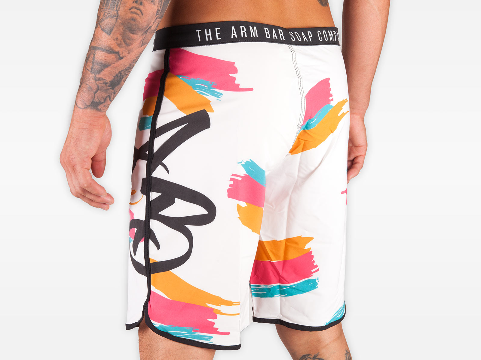
I’m on board with bright colors. And I’ve worked directly with a couple of clients on implementing bright colors. Some may not realize that we can get really bright colors on silk screen, and on offset printing, by adding neon colors or using Pantone colors, but it also impacts the budget of the project to get more pop.
As most of you know, the client is usually right, and my friend Chad from the Arm Bar Soap Co stays on top of his trends, and so we created an 80’s design training shorts, and they are selling like wildfire. The problem is, many of the brightest colors you can see on screen, just don’t translate to any product or print process. So this trend is limited by nature. But dye sublimation produces pretty vivid colors, and this design is popular because it’s following several of the: Bright bold colors, hand drawn strokes, and big, bold typography.
Bold Typography
I have noted that the over-arching trend in typography is shifting toward contemporary, which I like. I love a clean sans-serif font used in logo treatments, body text, and headlines alike. Companies that are disrupting an industry are onto this trend big time. Tesla, Uber, Google, Pandora, have all moved this way and lead the charge on it.
Hand Drawn
Yes, I like this trend. It’s part of what has been missing from design of late, the actual feel of a real brush stroke. New and old technology make this possible more than ever. Each stroke on the shorts above, was done manually, with the stroke of my Wacom tablet and pen. Newer computers like my new Dell Precision, are touch screen and stylus sensitive too, so more than ever, we have a chance to use our real hand-eye coordination and return to our fine art roots.
Semi-Flat Design
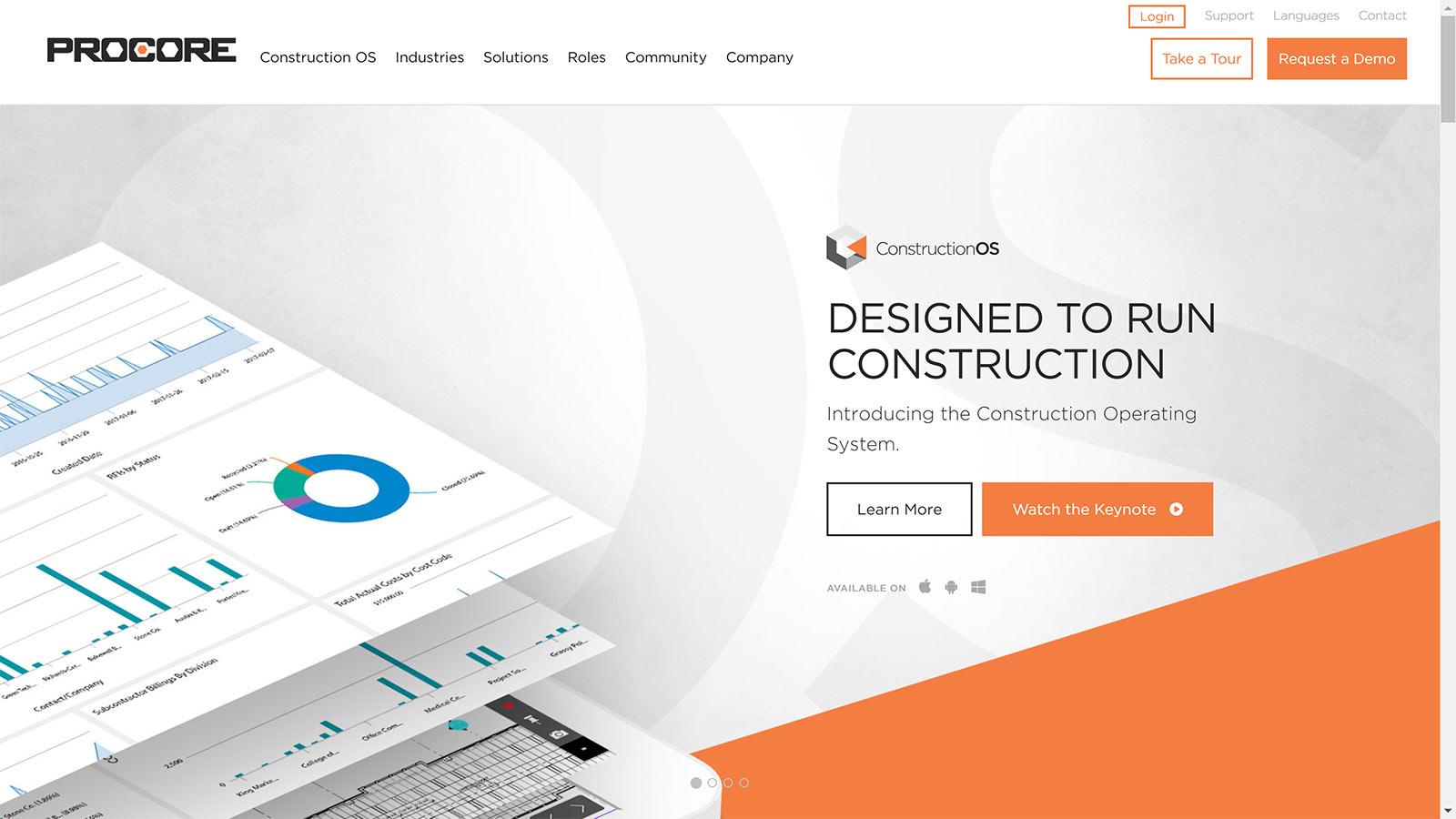
I’m a fan, I’ve used this technique for years now. Having a light shadow to highlight products or menu options you need, or layers, is important. Here’s a nice example of it from PROCORE, I noticed as I perused their web site. Well done PROCORE team! I’m watching…notice they are also using several of the current trends I like: 1. Bold Typography (I’ve been a fan of Gotham for many years) 2. Semi-Flat Design 3. Bold Colors 4. 3-D elements, and something else that I believe is on the way back, is use of texture and pattern.
Video
We all know this is here to stay. It’s the biggest trend in publishing and design and it will continue.
Cinemagraphs & Animations
These are cool, and I believe the subtle animation is a trend we’ll see more of for email creative, on web sites, perhaps billboards. They look professional and they stop a viewer in their tracks because they are unexpected, and immediately focus your attention on the highlighted motion in detail.


Another very informative post Gabe. So cool to get realtime input from a practicing professional 😃 Keep up this valuable info resource Gabe!